Data Visualization: Spin Direction
As Statcast turned from using Trackman (radar based) to Hawkeye (optical), more data has become available. Additionally, over the years, a focus on spin – rate and direction – has become more mainstream and we now have a better understanding of pitch characteristics and sequencing to better develop a pitcher. Driveline has a nice article on reviewing the axis of rotation and recently Baseball Prospectus dove into Seam-Shifted Wake (SSW). Additionally, Driveline has recently published work on SSW. This post isn’t about SSW or spin axis per se, more about visualizing the rotation with the remaining of this blog post being how to create the visualization.
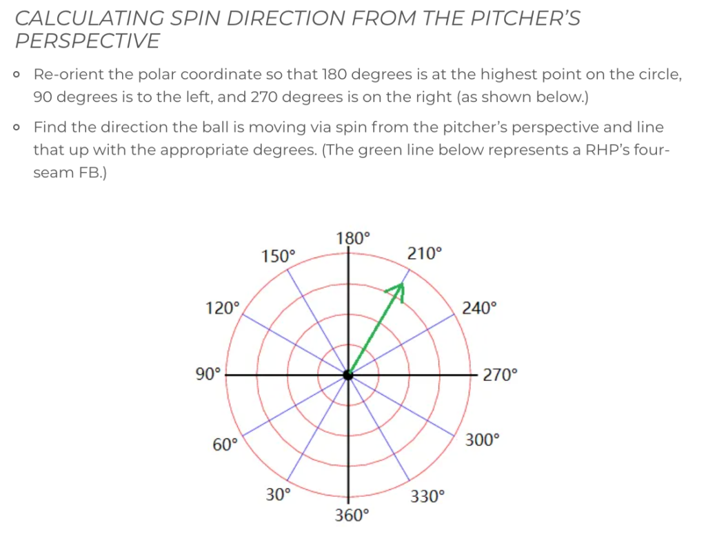
In the first link from Driveline, they provide the following visual and description:

With data, we can recreate the visualization, and we have two sources. First, we need to acquire two datasets, let’s call them Statcast_2020, which is all the pitches from Statcast in 2020 and then the spin rotation data, called spin_direction_pbp, which comes from Bill Petti:
The first step we need to do is to read in the data and combine the two datasets in R:
###
library(readr)
# Full Statcast
Statcast_2020 <- read_csv("Downloads/Statcast_2020.csv")
# Spin Direction (Bill Petti)
spin_direction_pbp <- read_csv("Desktop/spin_direction_pbp.csv")

# Merge the two files
# Common variables of batter, pitcher, game id, pitch number, inning
# Create the file name Statcast_2020_spin_direction
Statcast_2020_spin_direction <- merge(Statcast_2020, spin_direction_pbp, by = c('batter','pitcher','game_pk','pitch_number','inning'))
Now that the data is merged, let’s take an example look of Gerrit Cole’s 2020 spin direction. We first need to select our important variables (I will select the variables I used in normal pitch analysis, but only the player_name, pitch_name, release_spin_direction will be needed for this analysis). We also need to get the average direction and frequency (which will be the length of our arrows).
# Select the important variables
# Filter only to our pitcher (Gerrit Cole) and remove missing pitch names
# Save as "Cole"
# Use dplyr package
library(dplyr)
Cole <- Statcast_2020_spin_direction %>%
filter(!is.na(pitch_name) & player_name == "Gerrit Cole") %>%
select(player_name, pitch_name, release_speed, release_spin_rate, release_spin_direction, release_extension, release_pos_x, release_pos_z, release_pos_y, pfx_x, pfx_z, plate_x, plate_z, vx0, vy0, vz0, ax, ay, az)
Cole <- Cole %>%
group_by(pitch_name) %>%
summarise(release_spin_direction = mean(release_spin_direction), count = n()) %>%
mutate(freq = count / n()) %>%
filter(!is.na(pitch_name))Now using ggplot2 and ggthemes, we can construct the visualization from the pitcher’s point of view (180° at the top)
library(ggplot2)
library(ggthemes)
ggplot(Cole, aes(x = release_spin_direction, y = freq, color = pitch_name)) +
# Use polar coordinates and start at pi (180° at top and going clockwise)
coord_polar(start = pi, direction = 1) +
# Break the circle up by 30° and label those points
scale_x_continuous(breaks=seq(0, 360, by=30), expand=c(0,0), lim=c(0, 360)) +
# Create the arrow on the polar chart with the length being frequency
geom_segment(aes(y = 0, xend = release_spin_direction, yend = freq, color = pitch_name),
arrow = arrow(length = unit(0.3,"cm")), size = 1.5) +
# Scale colors
# Red = fastball, blue = changeup, purple = curveball, orange = slider
# You can pick your own colors, these are just what I use
scale_color_manual(values = c("red", "blue", "purple", "orange")) +
# Make theme black and white
theme_bw() +
# Add the labels
labs(title = "Gerrit Cole Average Spin Direction",
subtitle = "2020 Season\nPitcher PoV",
caption = "Data: Baseball Savant and Bill Petti\nData Visualization: TDK Baseball",
x = "Average Release Spin Direction",
color = "Pitch Name") +
# Remove y-axis and make the text bigger
theme(axis.title.y = element_blank(),
axis.text.y = element_blank(),
axis.ticks.y = element_blank(),
text = element_text(size = 15))
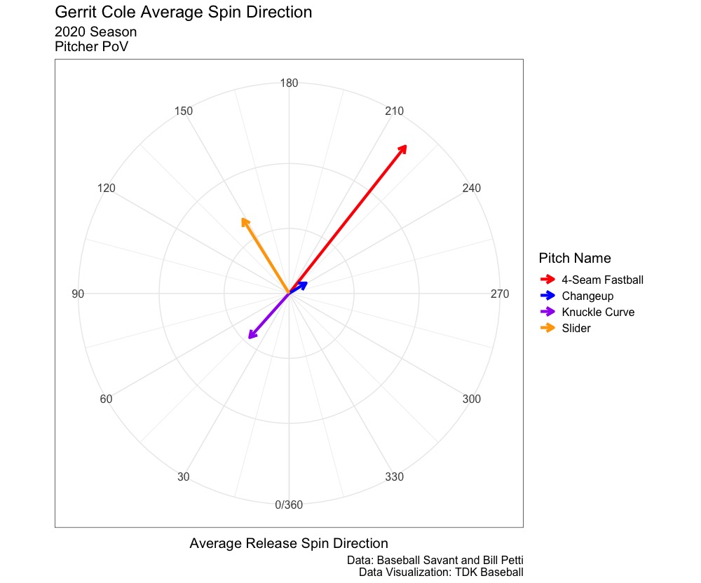
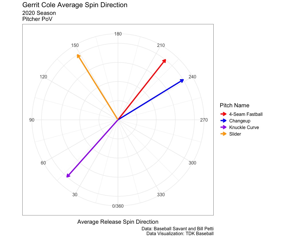
This produces the following:
The image on the left is the one in which the code will produce, where the arrow length is determine by the frequency of the pitch thrown. The image on the right, the arrows are all the same length (yend = 1 in the code) to visualize the true average spin direction of each pitch type from the pitcher’s point of view.
This is a way to visualize a pitcher’s spin direction, and one of ways to visualize certain pitch qualities. The full code is on my GitHub, and I will begin to update the GitHub with code that I use to create other visualizations.


Leave a Reply